Ranjit Singh Sahota AS Media Studies
The following production is a beginning of a horror/comedy film. In the following scene we would look into the essential basics of the mise-en-scene (arrangements of scene). Such as: Sound, Lighting, Editing, Cinematography
Sunday, 27 March 2011
Saturday, 26 March 2011
Thursday, 10 February 2011
Sunday, 6 February 2011
Wednesday, 2 February 2011
Small change in the genre for the final piece
The whole group sat together, and decided the group should include some comedy in the horror scene, as this would make it more interesting for the audience 15 or over. We decided to change the story board and the main structure of the story, however the plan before has helped us a lot, as it provided us information of the horror genre. We all decided to search into comedy/horror combined movies, which would influence us to our final piece.
The whole group then started to change the story slightly, however the location setting stayed the same.
The whole group then started to change the story slightly, however the location setting stayed the same.
Friday, 28 January 2011
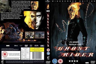
Horror film DVD cover - Gost Rider
This design is excellent for a DVD cover, as style of the cover include main character on the front and the tittle stands out, from the black backgrounds due to the red shading. The suitability age is also shown on both sides of the cover which allows adults to know if suitable for their children. On the left side, it includes small screen shots and a brief information about the film. This is a good technique to use to attract attention, which would make consumers read the back of the DVD cover, to get a small feeling what the film is about.


Monday, 24 January 2011
Subscribe to:
Comments (Atom)


